
Clarifying Machine Status
Designing a scalable visual system for machine recognition and status.
Context
This work was completed as part of the Case IH FieldOps platform, a web and mobile application that helps farmers monitor equipment, manage field operations, and make decisions using real-time machine and agronomic data. The goal of this project was to redesign the machine icon system so operators could quickly recognize machine type, status, direction, and brand while navigating the map.
My Role
I led the visual design of the project from concept through implementation, partnering with product managers, collaborating closely with developers, and supporting customer testing to deliver a solution grounded in real operator needs.
Why This Work Matters to Me
Agriculture motivates me because it is an industry where thoughtful design directly supports people doing essential, hands-on work. When operators can understand machine status at a glance, their work becomes easier, safer, and more efficient. Knowing that design can have that kind of real-world impact is what makes projects like this especially meaningful to me.
Problem Summary
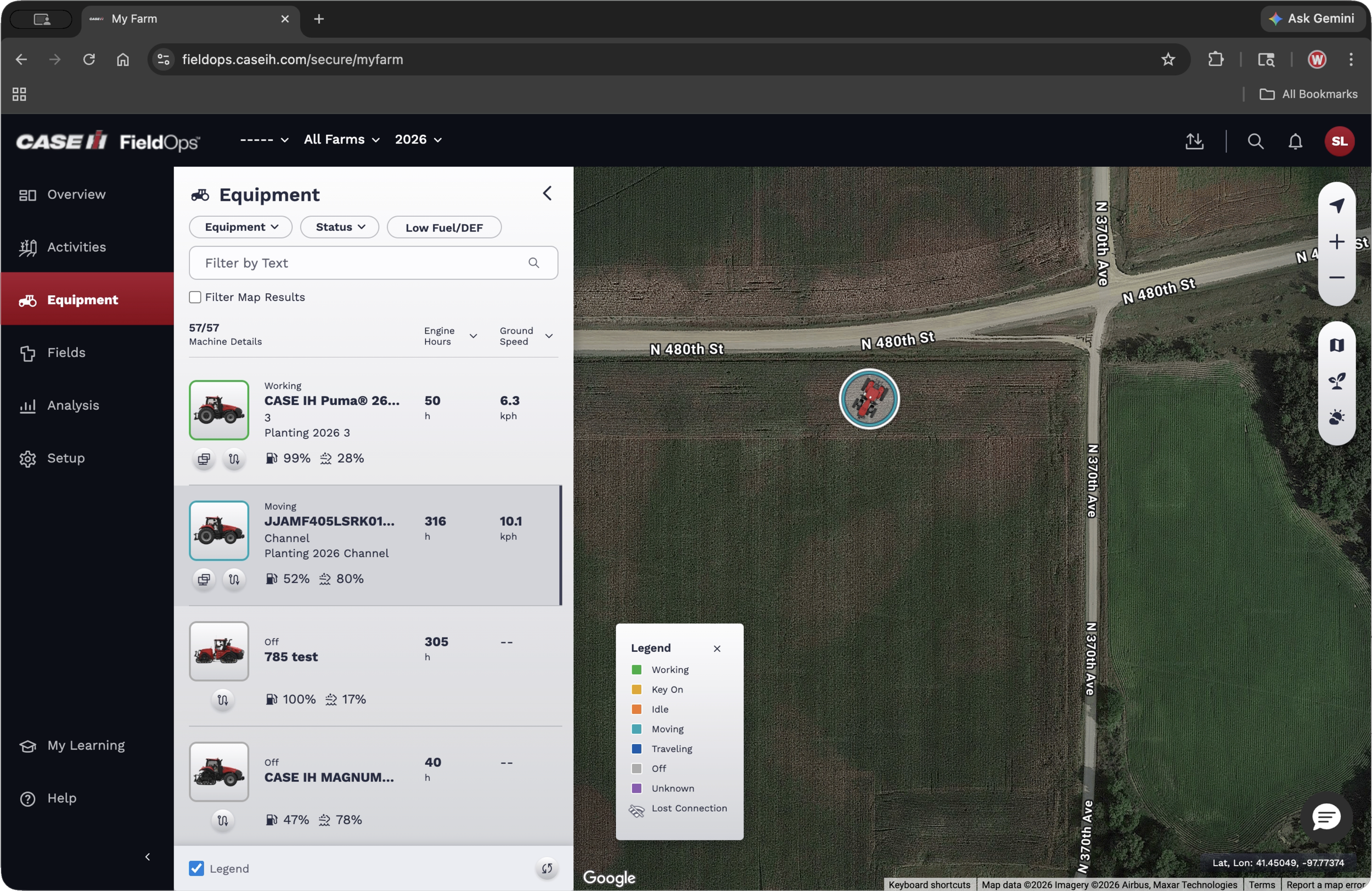
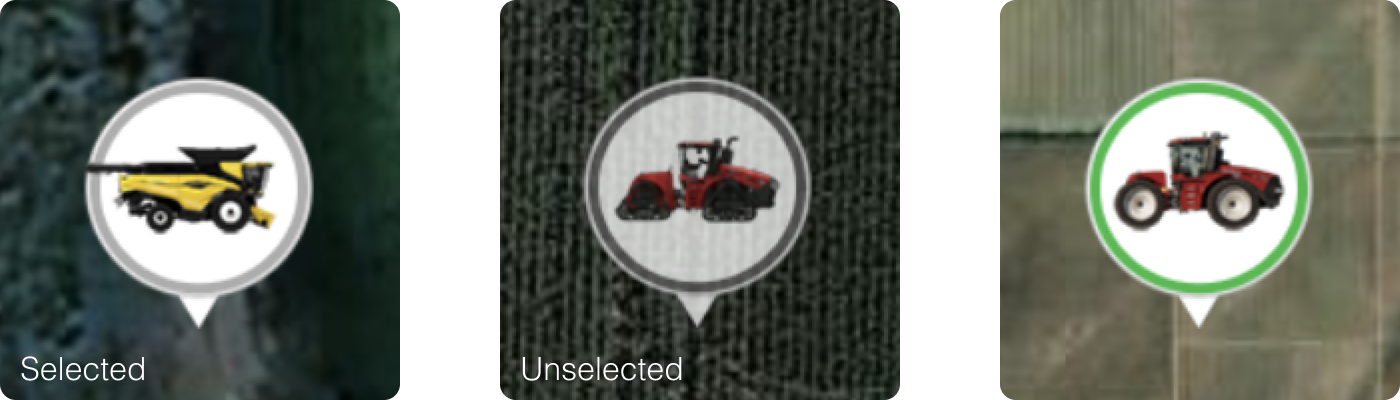
Before
Icons showed machine location but not heading or direction.
Photographic side views created inconsistent, overly detailed representations.
The selected state was subtle and easy to overlook.
Machine status required additional interpretation, increasing cognitive load.
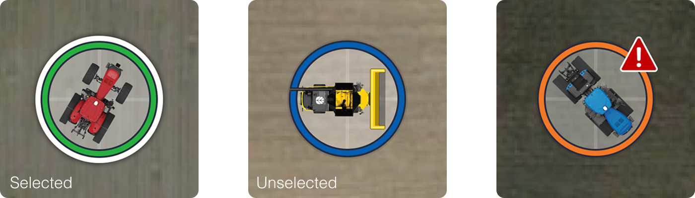
After
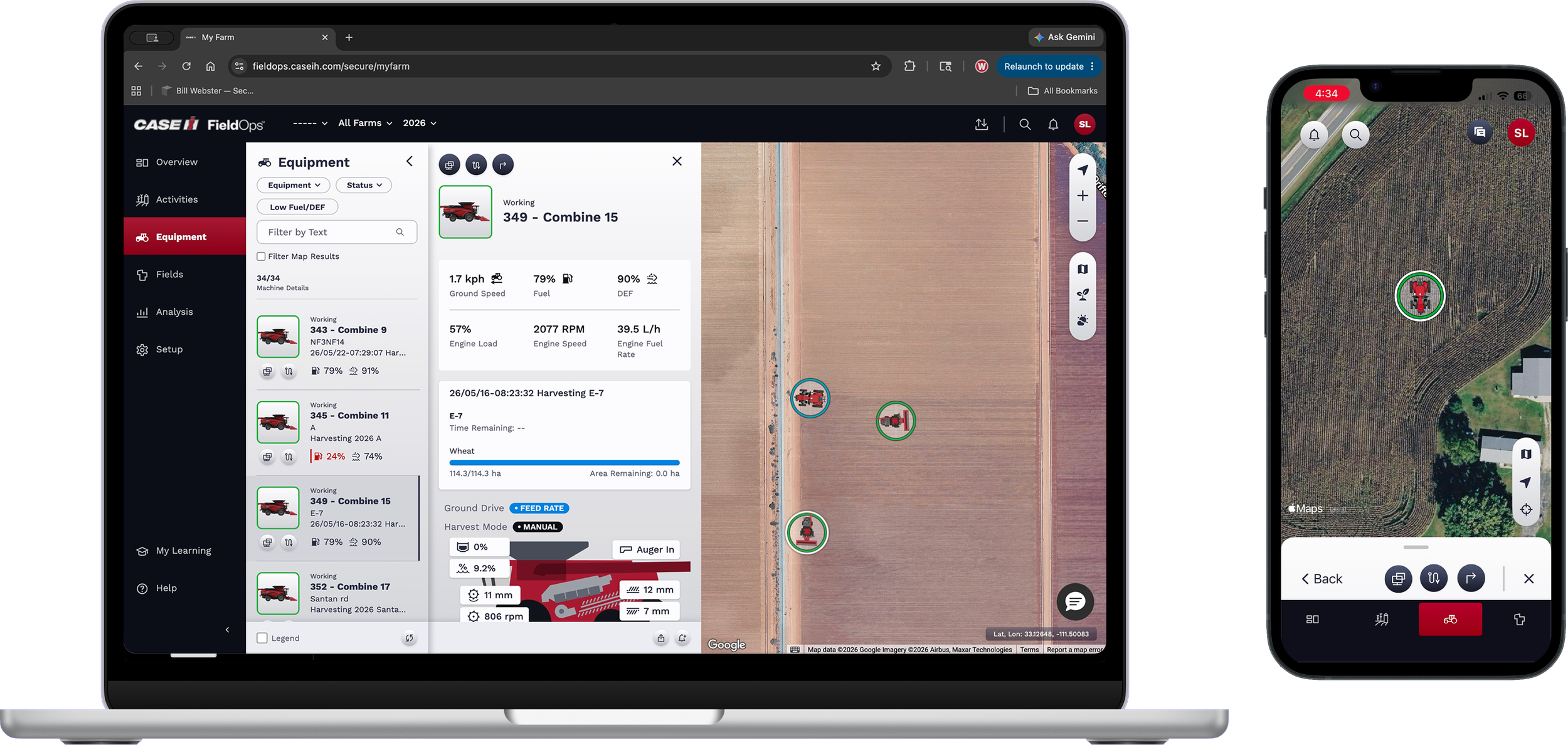
Top-down icons clearly communicate machine heading and orientation.
Simplified, consistent shapes make machine types easy to recognize.
The selected state is immediately recognizable.
Status badges provide additional context while maintaining a clean visual hierarchy.
Customer Validation
Customer feedback confirmed that the redesigned icon system improved clarity and usability:
Operators immediately understood machine direction using the new top-down orientation.
The top view reinforced where each machine was working within the field, making the map easier to interpret.
Participants found machine types easy to recognize using the simplified icon system.
Feedback also confirmed that the redesigned selected state was much clearer and easier to identify.
Benchmarking & Insights
Benchmarking
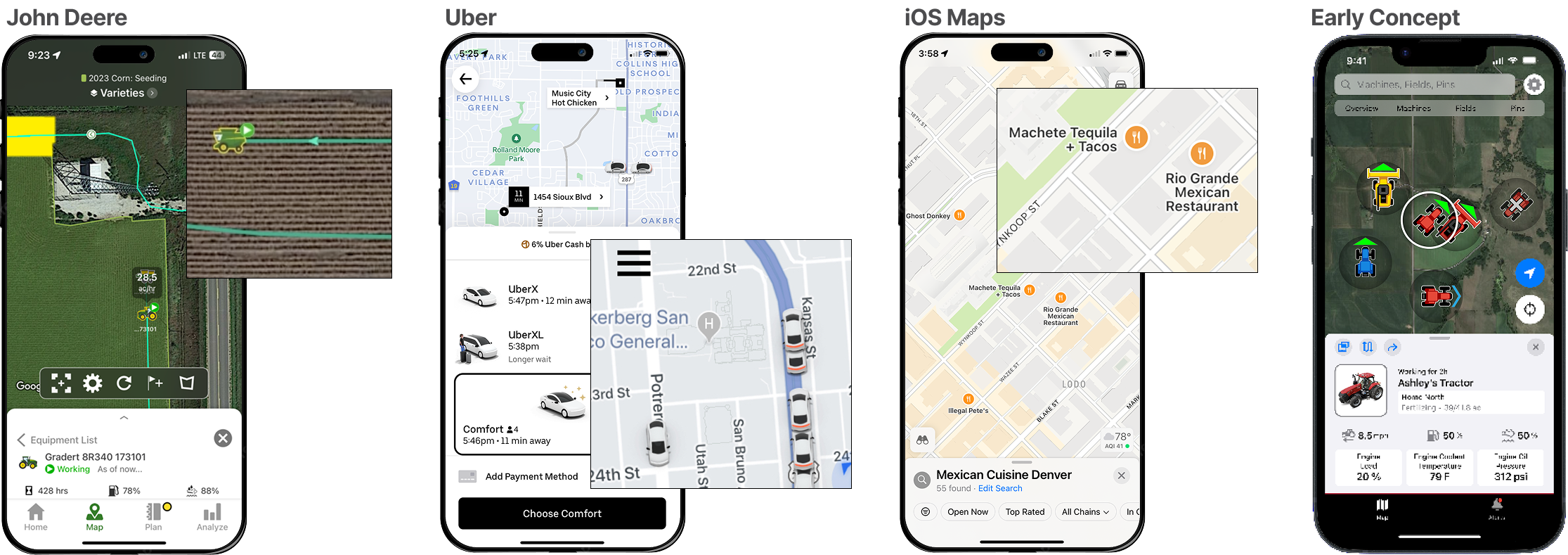
I benchmarked agricultural platforms alongside consumer mapping applications, including John Deere Operations Center, Uber, and Apple Maps, to understand how vehicles, direction, and status are represented on maps. These patterns informed a more intuitive and consistent approach for agricultural equipment.
Defining the Direction
Early exploration focused on overhead machine views, which quickly emerged as the strongest direction for communicating heading and orientation while creating a consistent visual language across machine types.
Information Hierarchy
An information hierarchy was established to prioritize the details operators need most, making it easier to interpret machine status quickly and confidently.

Exploration
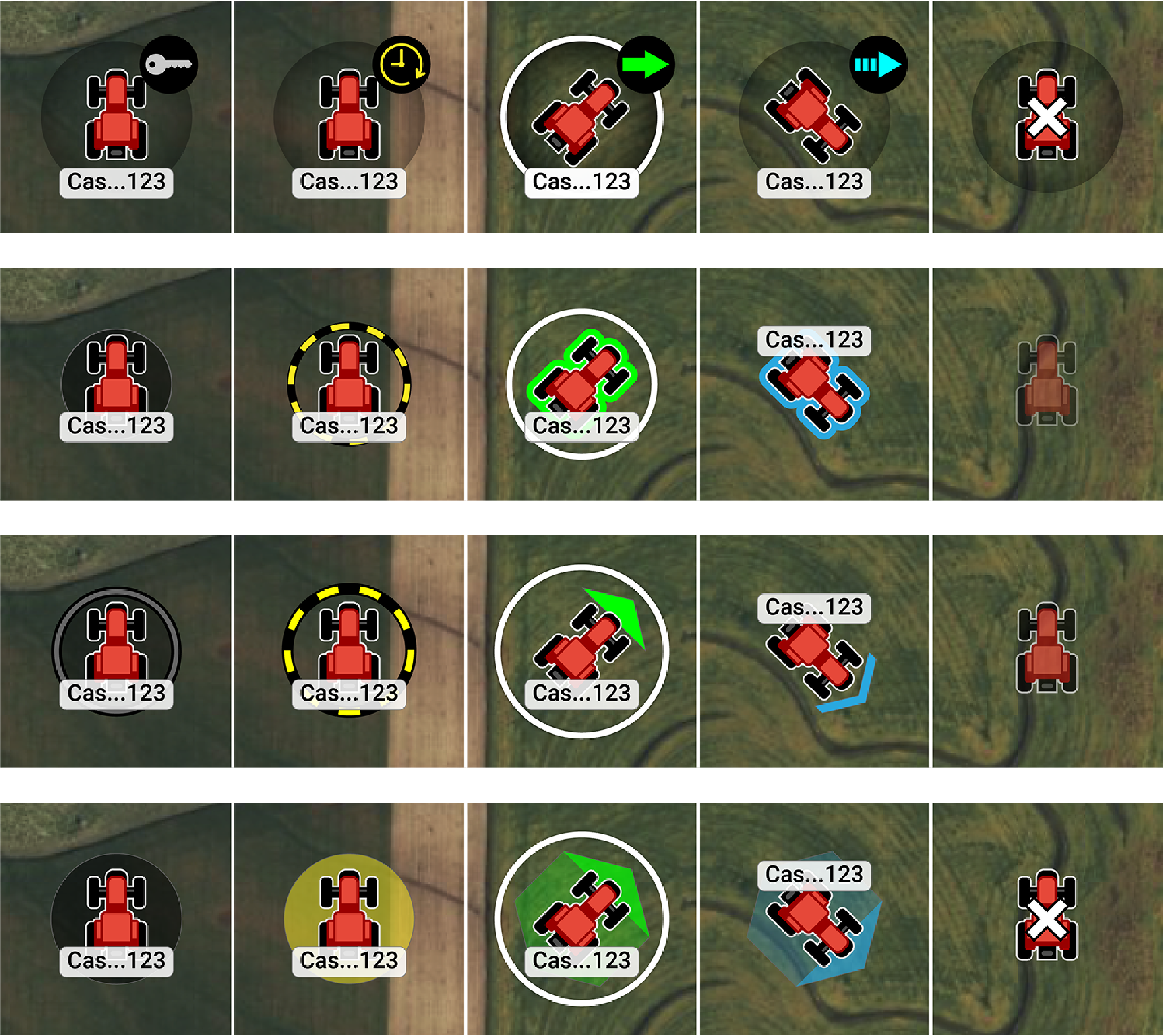
I explored multiple icon directions to balance recognition, orientation, and visual simplicity. Through iterative refinement, the strongest concepts were those that communicated the most information with the least visual complexity.
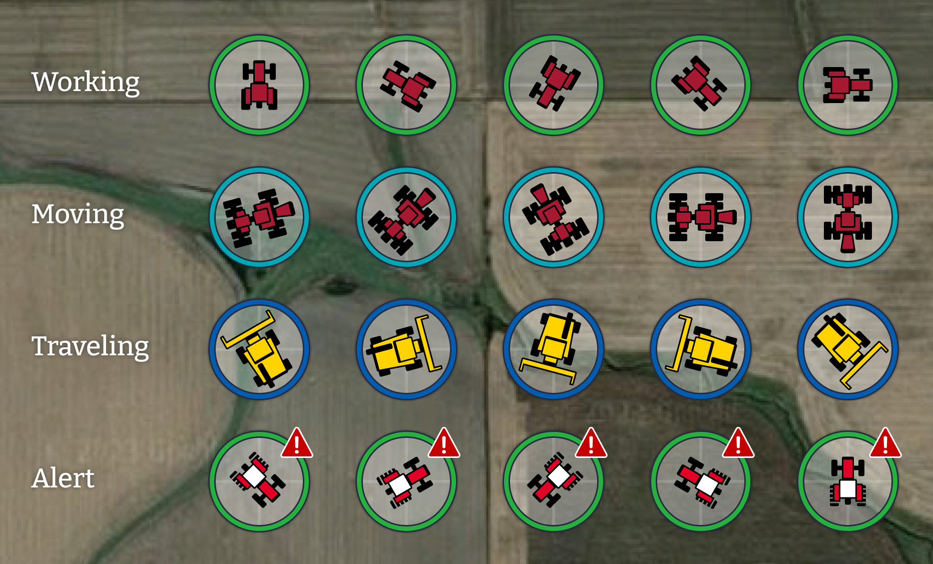
Final Icon System
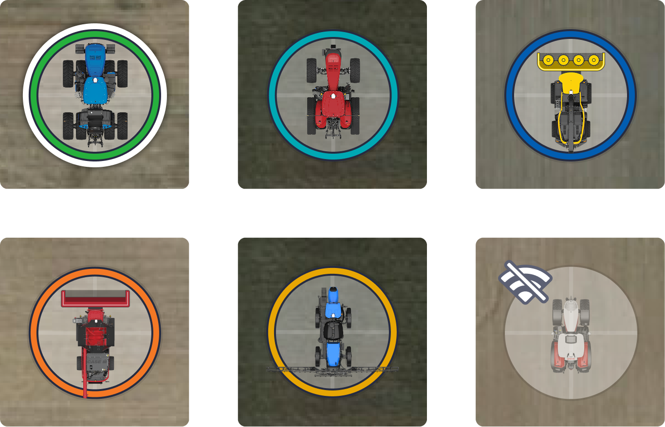
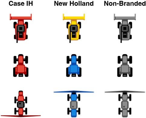
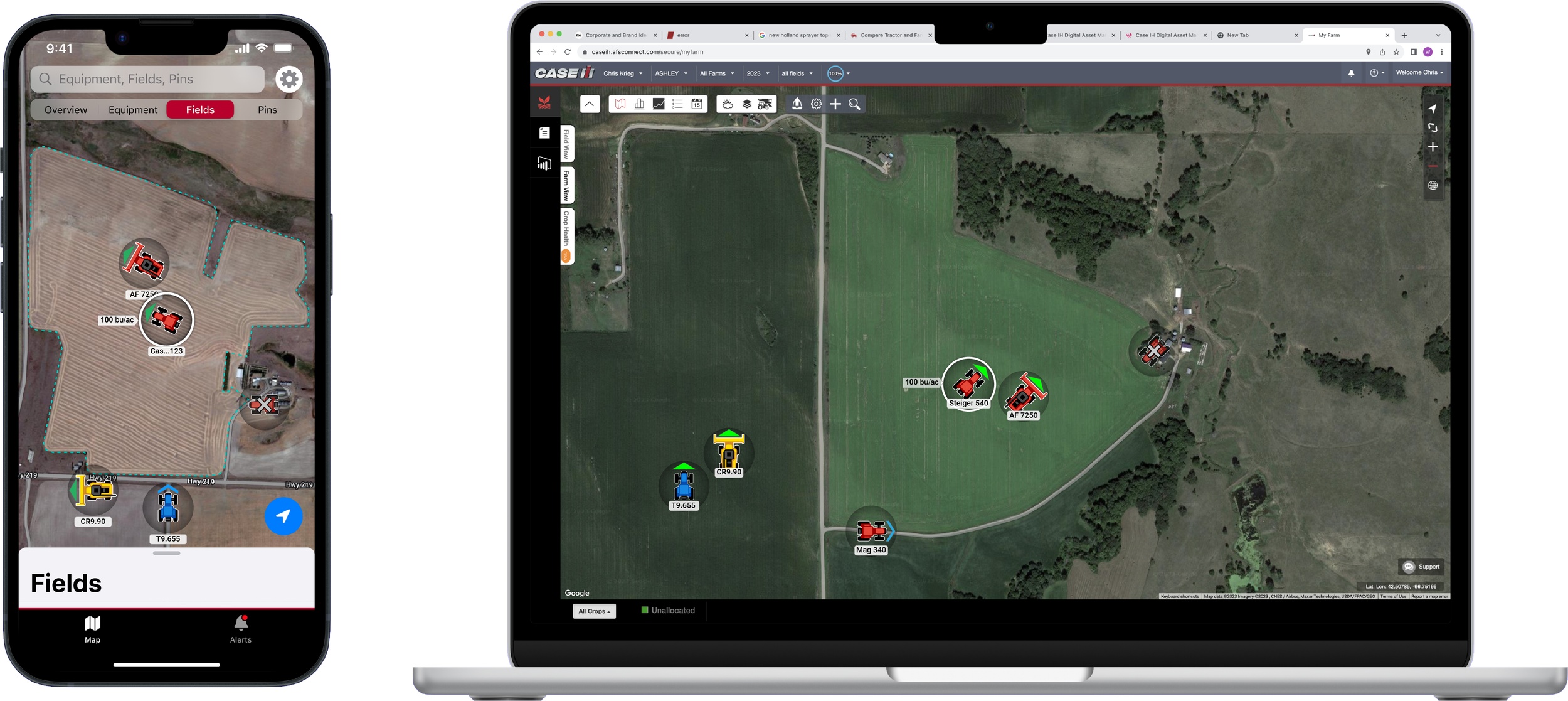
The final icon system establishes a cohesive visual language that helps operators quickly recognize machine type, heading, status, brand, and alerts. Built around a clear information hierarchy, the system scales reliably across map zoom levels while maintaining clarity and consistency.
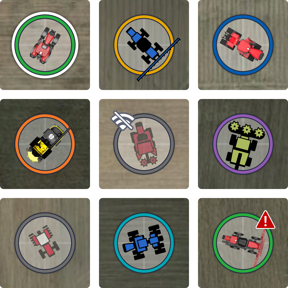
Examples of various machine types, brands, and render styles
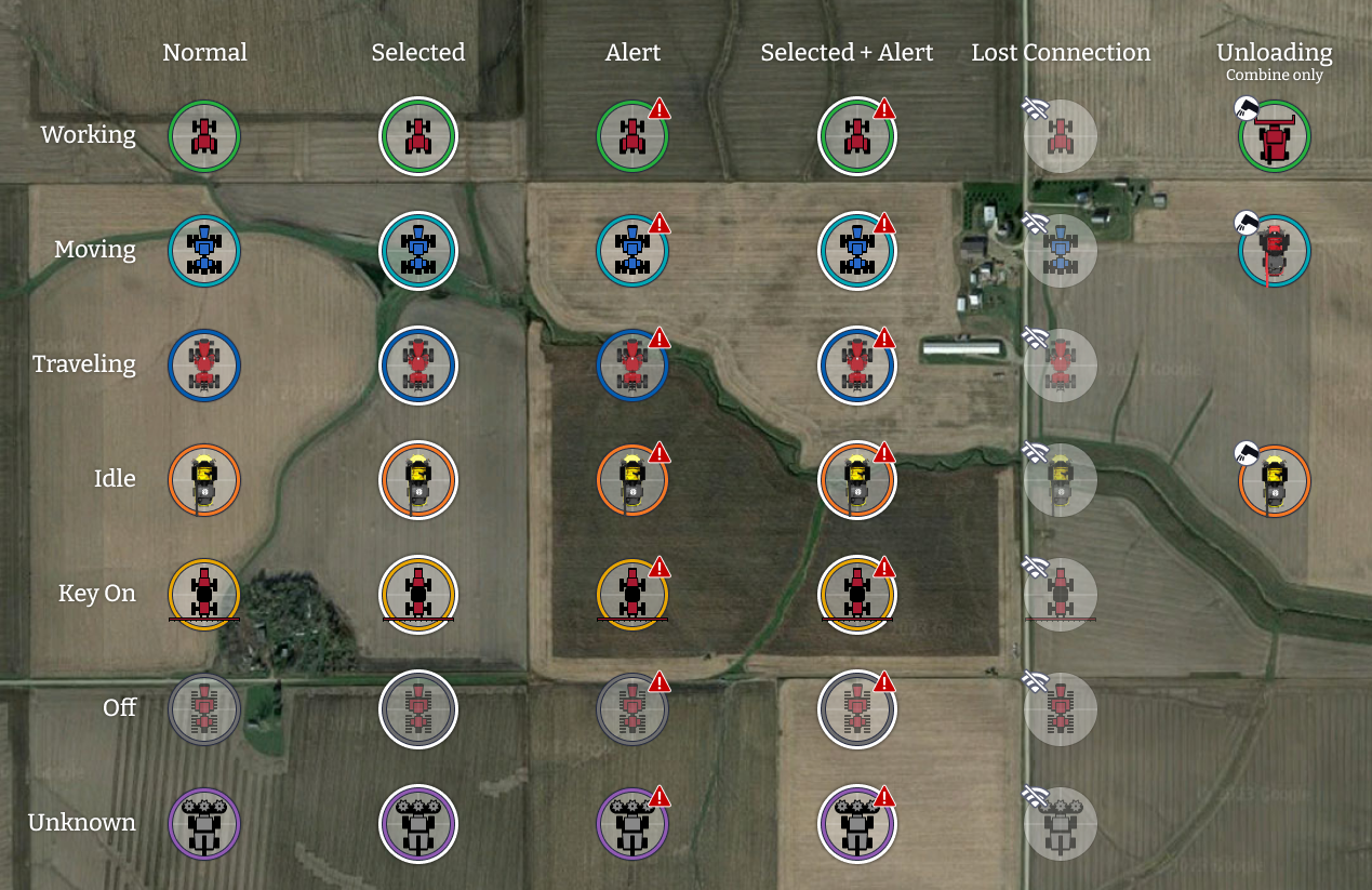
Complete icon system
Building a Complete System
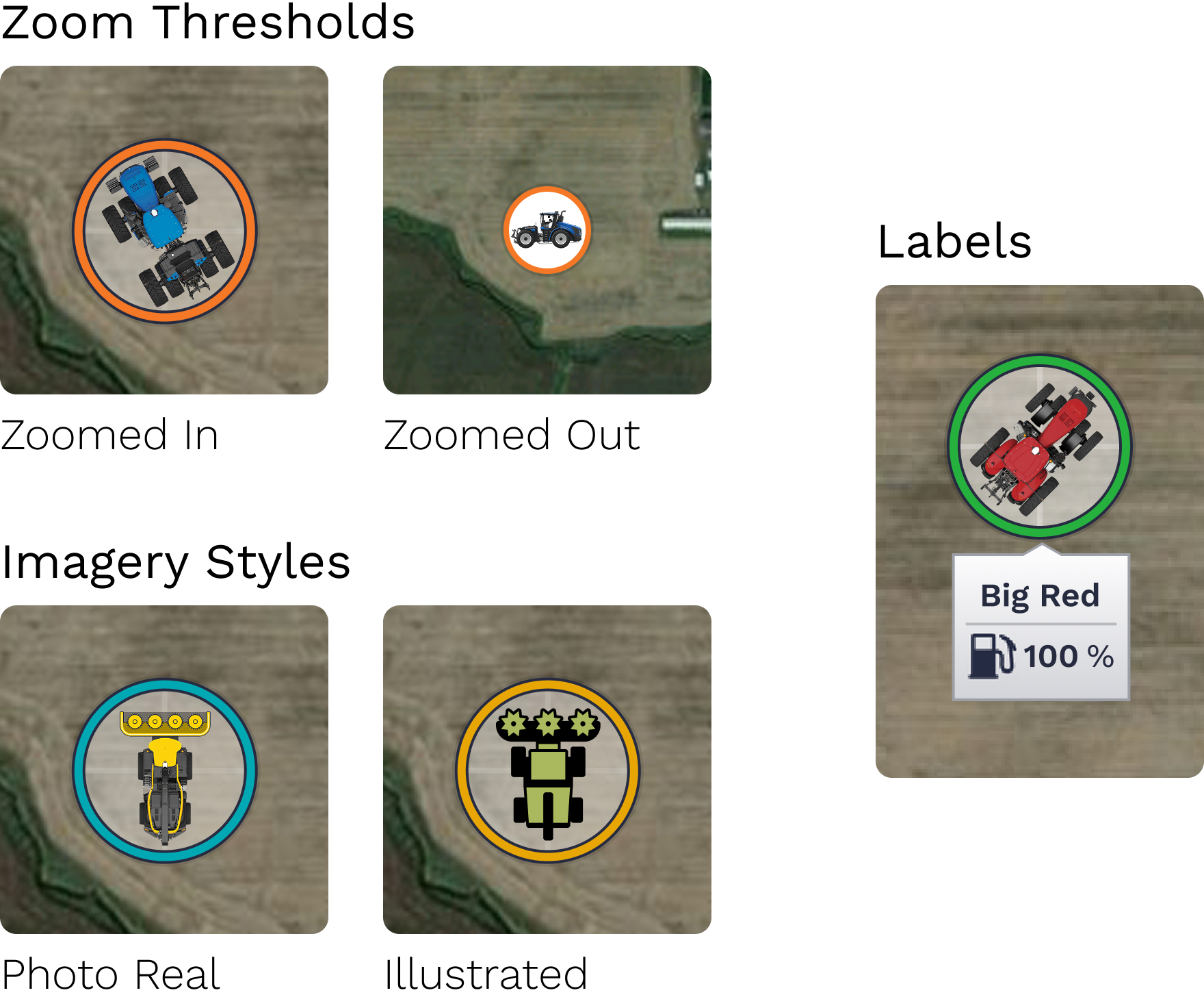
Beyond the core icon redesign, I developed supporting elements that ensured the system remained flexible and consistent across a variety of map contexts.
Defined zoom thresholds with two icon scales
Updated machine labels with user-selectable parameters
Supported both illustrated and photo real machine imagery
Design Outcomes
The redesigned visual system delivered meaningful improvements for operators by making essential information easier to understand at a glance.
Faster machine recognition
Clearer status awareness
Reduced cognitive load
A more modern and cohesive product experience
From Design to Delivery
Beyond designing the icon system, I managed the production pipeline to ensure every asset was accurate, scalable, and implementation-ready. My responsibilities included:
Processing and refining machine renders
Designing illustrated assets
Building a structured asset library
Delivering production-ready assets to engineering
Supporting implementation to ensure visual accuracy and consistency
Innovation
This work contributed to a provisional patent related to digital product and interface innovation.
Reflection
This project demonstrated that successful visual systems are about more than creating individual assets. They require thoughtful information hierarchy, consistency, scalability, and close collaboration from concept through implementation. Leading the work across design, production, and development strengthened my belief that the best solutions remain clear for users while also being practical for the teams who build and maintain them.
What I enjoy most about projects like this is the opportunity to transform complex requirements into clear, cohesive visual systems that help people make confident decisions. It's the combination of strategic thinking, visual design, and real-world impact that makes this work especially rewarding.